Jobsolver Logo Design
2019
1. The first phase was research
I have to get to know the company before I start to design a logo for them. It’s essential to get this information in written format, so I created a detailed survey for the company. I used Typeform for that.
The first group of questions is about brand.
The most significant and important part of the survey; it was 18 questions in this case.
Some example questions from this group:
- What is Jobsolver?
- What is the purpose of Jobsolver?
- What is the benefit of Jobsolver? How do you help your audience, and what problems do you solve?
The second group more broad questions.
I ask respondents to imagine different situations before answering.
Some example questions from this group:
- How do you describe the style of your brand?
- How do you imagine your company after 5, 10, and 15 years?
- What famous person would you choose for your brand advertising face? Why her/him?
In the third group I ask about logo design.
Some example questions from this group:
- Is there any shape or symbol you would like to see in your logo?
- What type of logo can you imagine for your logo? (Monogram, Wordmark, Symbol, Abstract, Contemporary, Classical, Emblem, etc.)
- Where would you like your logo to appear in the future? (eg. web, t-shirt, poster, watermark)
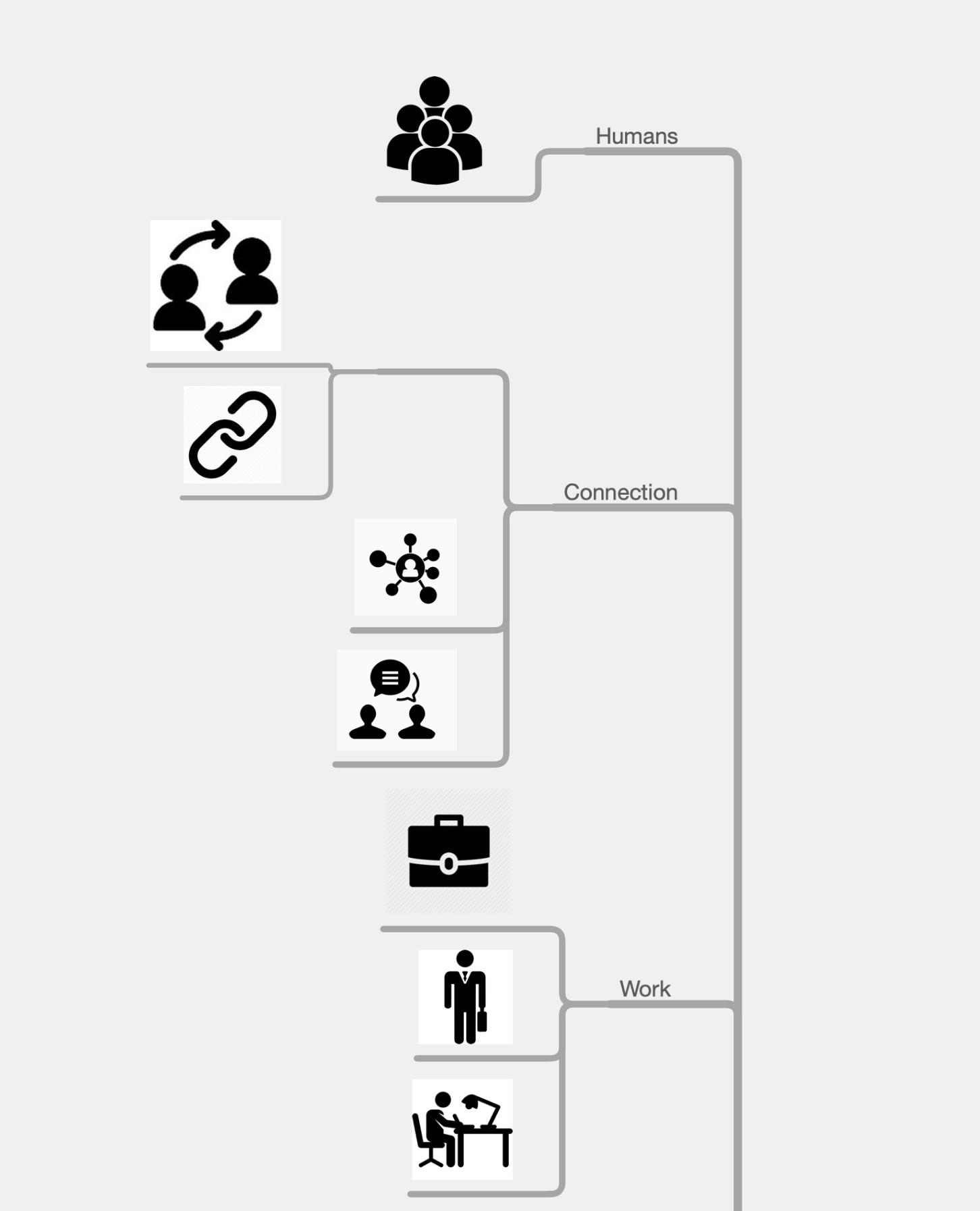
2. The second phase is organizing captured information
I collected the data and organized it in a mind map. I have decided which shapes, symbols, fonts, and color combinations can be fit for the company. An important aspect was to make the logo look great on thumbnails of job ads.
3. Hand drawing and trying different ideas digitally
I created a lot of different concepts in this phase; these versions were only drawn broadly. The goal was to find the best shapes and ideas.
![]()
![]()
![]()
![]()
![]()
4. Design of the final logo

Pie chart + Candidate
The pie chart indicates that Jobsolver will review every candidates’ data and background experience. They create an analysis to find the most suitable candidates for the position.
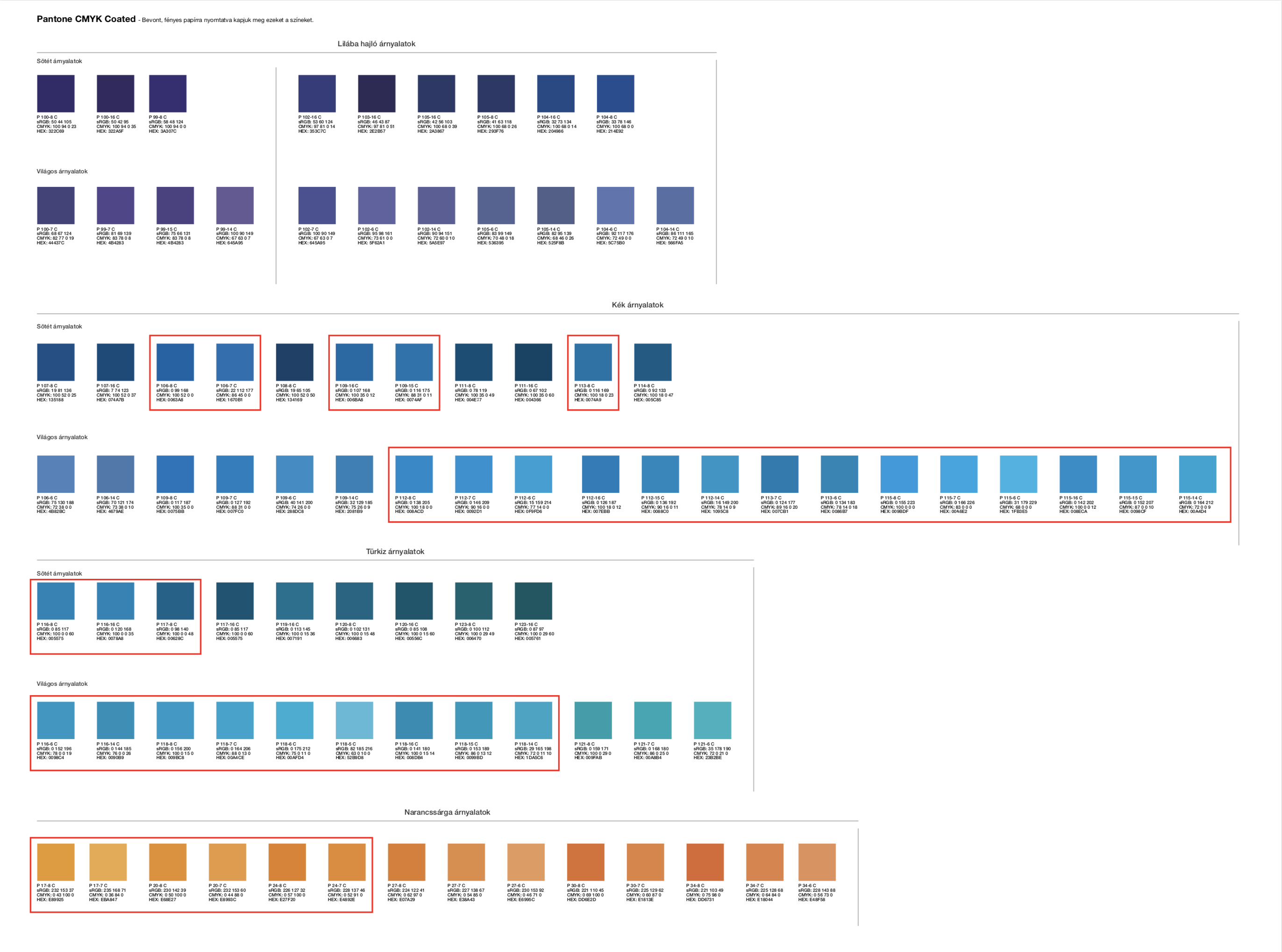
5. Define colors
I selected blue and orange colors from the Pantone chart then I tried them in different combinations on the logo.
Blue: confidence, composure, stability, strength, knowledge, intelligence, wisdom, strength
Orange: youthful, energetic
Orange appears as a complementary color that can give a bit of rest to the blue’s powerful “corporate” message. It brings youthfulness and energy into the brand.
The final logo was designed in portrait and landscape on white and blue background, in Black & white and grayscale version.